


Screen Sizes
A complete list of commonly used device parameters, including device parameters for different models of mobile phones, tablets, and computers
Tags:Design Specificationsdevice specifications mobile development Responsive Design screen sizes web development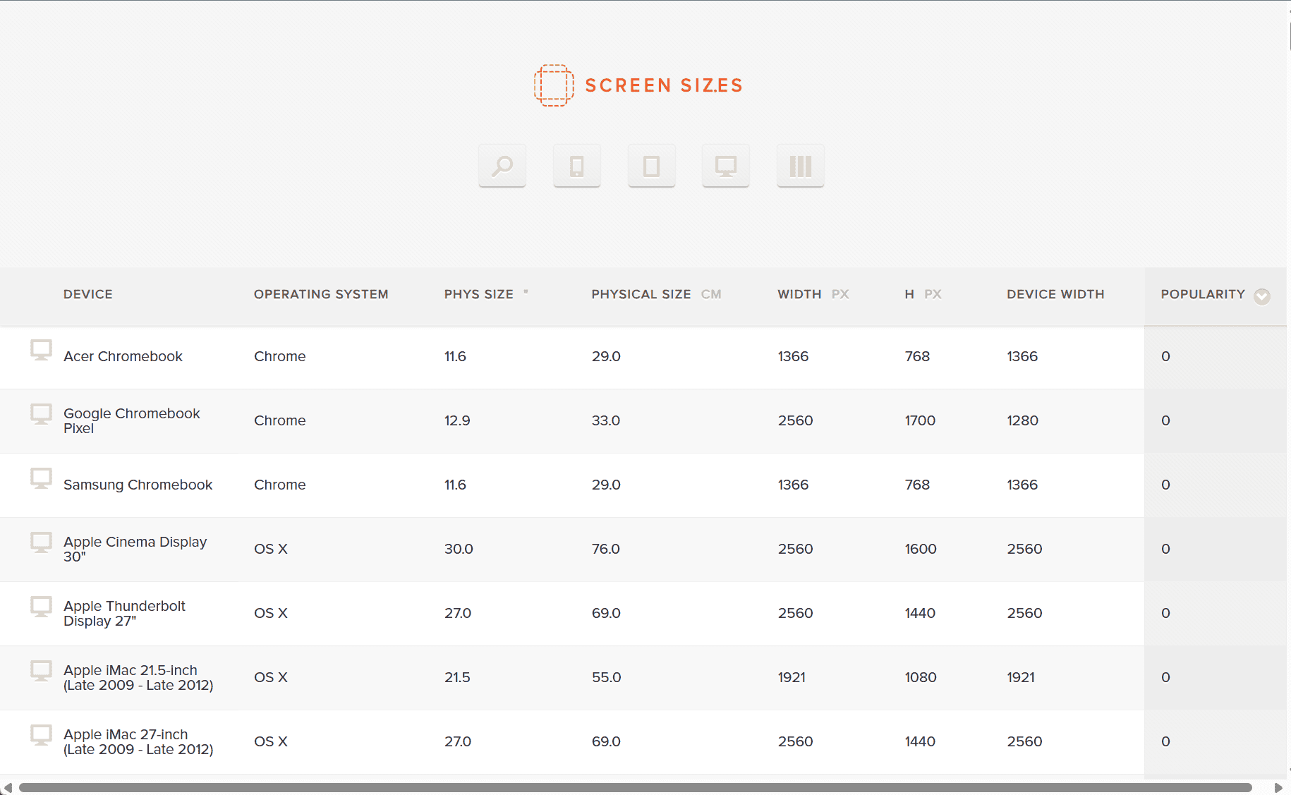
ScreenSizes is a comprehensive tool designed to help developers and designers find detailed screen specifications for a wide range of devices. It is particularly useful for those who need to ensure that their websites or apps are optimized for various screen sizes, resolutions, and device types. The platform provides a user-friendly interface that allows users to search for devices based on their screen size, pixel density, and resolution, making it a go-to resource for mobile and web developers.
With the rise of mobile-first design, ensuring that websites and applications display correctly on a variety of devices has become increasingly important. ScreenSizes allows designers to filter results based on specific device types, including smartphones, tablets, laptops, and desktops. Users can access detailed information about a device’s screen size, resolution (both portrait and landscape modes), and pixel density (PPI – pixels per inch). This data helps developers build responsive websites and apps that automatically adjust their layout to suit different screen sizes.
One of the key features of ScreenSizes is the ability to compare multiple devices side by side. This is invaluable when trying to determine how a design will look on different screens or when ensuring that a responsive design will perform well on various devices. The platform makes it easy to assess whether a particular design will look good on both small screens, like smartphones, and larger screens, like tablets or desktop monitors.
ScreenSizes also provides information on the aspect ratio of each device, which is crucial when designing user interfaces. Different devices may have varying aspect ratios, and understanding this variation helps designers avoid problems with scaling and cropping. By knowing the aspect ratio, developers can optimize the layout of content and ensure that important elements, like buttons or images, display properly across all devices.
For web developers, ScreenSizes provides valuable insights into the best practices for building responsive websites that perform well across various screen sizes. The platform’s device data is regularly updated to include the latest models, ensuring that users have access to the most current device specifications. This means that developers can rely on ScreenSizes to stay up to date with the latest trends in screen technology and maintain compatibility with newly released devices.
Additionally, ScreenSizes is not just limited to mobile and web development. It can also be used by marketers, product designers, and content creators who need to understand how their visual content will appear on different devices. Whether you’re designing a digital ad, social media post, or promotional image, having access to device-specific screen information helps ensure that your content looks great everywhere.
In conclusion, ScreenSizes is an essential tool for developers, designers, and anyone involved in creating digital content. By providing detailed and up-to-date screen specifications, the platform helps users create responsive and visually appealing designs that look great on all devices. Whether you’re building a website, app, or digital content, ScreenSizes helps you make informed design decisions to improve the user experience.
data statistics
Relevant Navigation


